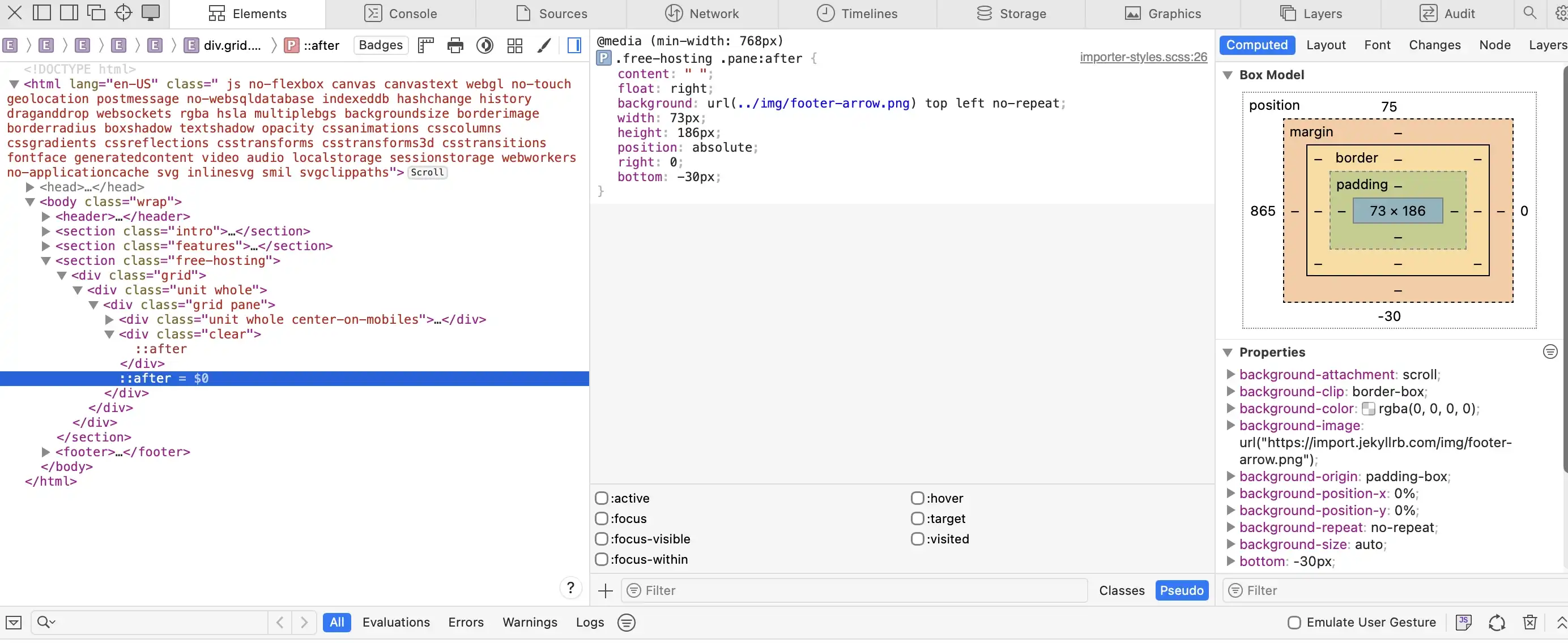
A01 - Extract UI Items

arrow on site breaking content border.
Arrow breaking content box

Arrow Overview Page

UI Item - Summary

I like the arrow extending beyond the boundary of the container because it becomes more visually appealing by breaking the rigid structure of the layout and creating a sense of movement, which draws the viewer’s eye.

UI Item - Techniques

To create this effect, you use a pseudo-element (::after) which allows you to add the visual element. You then style the pseudo-element by setting its width, height, and position. The background of the pseudo-element is set to an image of the arrow. By positioning it so that it extends beyond the container, it creates the effect of the arrow breaking outside the content boundary.

Triangle pointing to current page.
Triangle pointing to page

Navigation Triangle

UI Item - Summary

I enjoy the navigational arrow because it helps visually connect the content of the page to the corresponding area you are viewing in the sidebar. Not only does it create a visual connection and add interest, but it also helps direct the viewer to the content they are looking at, beyond just relying on different colored text.

UI Item - Techniques

To create this effect, you use a pseudo-element, even though it does not contain any actual content. By adding ::before, you are telling the browser to insert a visual element before the current item in the aside navigation. You then style this pseudo-element to form a triangle by using borders. By setting the width and height to zero and only applying color to one or two sides of the border, a triangle shape is created. Finally, you adjust the border style, size, and position to place the triangle exactly where you want it.

Box wrapping around outer page border.
Box wrapping around page

Callout Box Wrapping

UI Item - Summary

I like how the callout boxes wrap around the content area because they help visually break up the page, allowing important information to stand out while adding visual appeal. By the boxes wrapping around the content area, they naturally draw the viewer’s attention without being overwhelming and the use of color further strengthens the overall visual impact.

UI Item - Techniques

First, you create the overall content box that will hold the text. This is done by defining a class for the box and styling it with a background, such as a linear gradient, and adjusting the angle to achieve the desired visual effect. You can then use margin to offset the box slightly so it appears to break the page boundary. Next, apply a border-radius to only two corners while leaving the other two at zero to enhance the visual design.

To create the triangle that makes the box appear to wrap around the page, you use a pseudo-element (::before) and style it with borders. By setting the width and height to zero and adjusting the border style, width, position, and color, you can form a triangle. Only one or two sides of the border are given color while the others are transparent, which creates the triangular shape and completes the wrapped effect.

interior drop shadow of content.
Interior Drop Shadow

Interior Drop Shadow

UI Item - Summary

I like the interior drop shadow because it adds depth to the content on the page and creates a sense of layering, rather than everything appearing flat. It also helps draw the viewer’s eye to the section without being too distracting.

UI Item - Techniques

This technique is created by adding a box-shadow in your CSS stylesheet. To create an inner shadow, you use the inset value. For example:

box-shadow: inset 0 3px 10px black;

In this case, inset places the shadow inside the element, 0 controls the horizontal (x-axis) position, 3px controls the vertical (y-axis) position, 10px defines the blur amount, and black sets the color of the shadow.